Skip to content
Products
Close Products
Open Products
Products
Survey
Industry leader in flexibility and ease of use
Digital
Collect real-time digital feedback from your website or app
Pulse
Turn noisy text feedback into signals you can act on
Integrations & Automations
Connect data across systems to drive faster outcomes
Dashboard
Turn feedback into results
Services
Research Solutions
Trusted market research that will turn you into the expert
Brand Health Tracker
Brand performance insights at your fingertips
Professional Services
Custom-fit Alchemer Survey and Workflow to your business
Training
Product training for every level, at every stage
Solutions
Close Solutions
Open Solutions
Industries
Government
Education
Non-Profit
Financial Services
Food & Beverage
Retail
Software
Solutions
Customer Experience
Market Research
Employee Engagement
Resources
Close Resources
Open Resources
Blogs
Case Studies
Webinars
eGuides
Resource Library
From the Blog
Introducing Alchemer Research Solutions
Individual Pricing
1-800-609-6480
Support
Login
Request a Demo
Blog
Customer Story
Survey Tips
Solutions
Features
Company News
Press Release
Market Research
Product News
Subscribe to our blog
Search Results for: survey tips – Page 1
Alchemer Mobile
,
Customer Experience
,
Mobile Marketing
,
Product Management
8 Steps to a Better Mobile Customer Experience
Alchemer Mobile
,
Customer Acquisition
,
Customer Experience
,
Loyalty & Retention
,
Mobile Marketing
,
Product Management
More Mobile Customer Feedback = More Revenue
6 min
Alchemer Mobile
,
Customer Emotion & Sentiment
,
Customer Experience
,
Mobile Marketing
,
Product Management
How To Measure Mobile Customer Sentiment: Benchmarks for 2018
9 min
Uncategorized
5 Ways CIOs Can Develop Change Management Skills
14 min
Uncategorized
What is GDPR?
13 min
Alchemer Mobile
,
Customer Experience
,
Mobile Marketing
,
Product Management
The Customer Centricity Checklist
2 min
Survey Tips
The Importance of Storytelling with Data – Alchemer
5 min
Employee Assessments
What is Data-Driven Decision-Making in HR?
Employee Assessments
,
Survey Tips
6 Ways Your HR Department Can Leverage Big Data
Employee Assessments
Trending Topics in Compliance and Ethics
Employee Assessments
Get the Right Applicants with the Right Job Application Form
Alchemer Mobile
,
Brand & Reputation Management
,
Customer Experience
,
Mobile Marketing
,
Ratings & Reviews
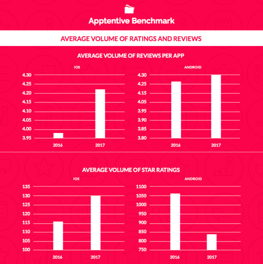
When Your Reviews Aren’t About Your App
7 min
< Previous
Page
1
…
Page
7
Page
8
Page
9
Page
10
Page
11
Next >
Start making smarter decisions
Contact Sales
Start a Free Trial
Subscribe to our Blog